BRYAN KELLY
SENIOR CONTENT DESIGNER
Hey there! I help create frictionless user experiences. All thanks to some visual communication design know-how, a little digital marketing expertise, and a keen business sense.

PORTFOLIO
RECOMMENDATIONS
Kate Agena
VP of Content Design
SAP
Sometimes you’ve got a challenging environment with many conflicting stakeholders and need a strong content designer who can hold their own, be diplomatic, and guide a project to a positive conclusion — that’s Bryan. He understands and has experience all around the business, including marketing. Bryan is also calm and strategic, seeing clear steps that can be taken to improve a situation.
Beccy Biermann Gürbüz, PhD
Senior UX Researcher
McAfee
Bryan is very good at cutting through differing opinions and finding common ground. He’s particularly good at dealing with high-pressure situations. And his broad skill set and cross-functional expertise make him a versatile partner who can collaborate well with teams across an organization. Above all, Bryan is a highly user-focused, detail-oriented content designer and a pleasure to work with.
Laura Wells
Product Designer
McAfee
There was a large chunk of time where Bryan and I were each other's design counterparts. I always looked forward to collaborating with him. He’s thoughtful about how UX content and interactions go hand in hand. On top of this, Bryan is also such a positive light in stressful situations. There were many times we had to pivot — whether it be vision or overall company priority — and he always made the jump seamlessly.
Neha Purohit
Principal Product Manager
McAfee
Bryan excels at translating complex requirements into clear user experiences. I've seen him navigate big challenges while maintaining focus on user needs. His ability to balance strategy with execution is invaluable. Bryan consistently showed a rare combo of technical understanding and communication skills that strengthened our working relationship.
PUBLISHED WRITING
CONTACT
Get in touch! Have portfolio questions?
Want to see my resume? Send a message.
© Bryan Kelly. All rights reserved.
McAfee
McAfee is an online protection SaaS company in San Jose, California with hundreds of millions of users worldwide. In 2021, they refocused the business on consumers and needed to rapidly build several innovative identity and privacy security tools beyond antivirus protection for devices.
PROJECT 1: FEATURE REDESIGN - PERSONAL DATA CLEANUP
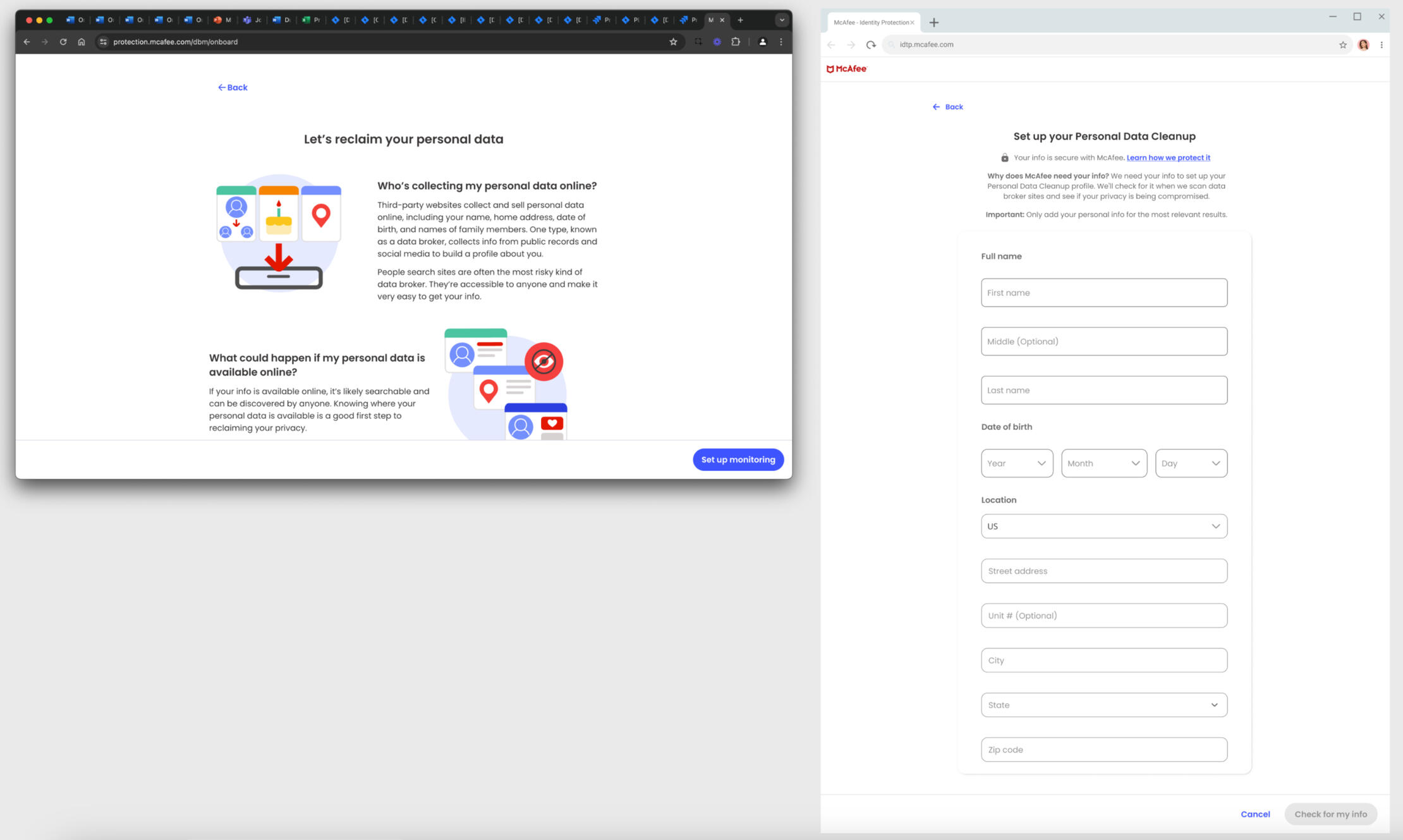
SAMPLE OF ORIGINAL CLUTTERED ENROLLMENT SCREENS
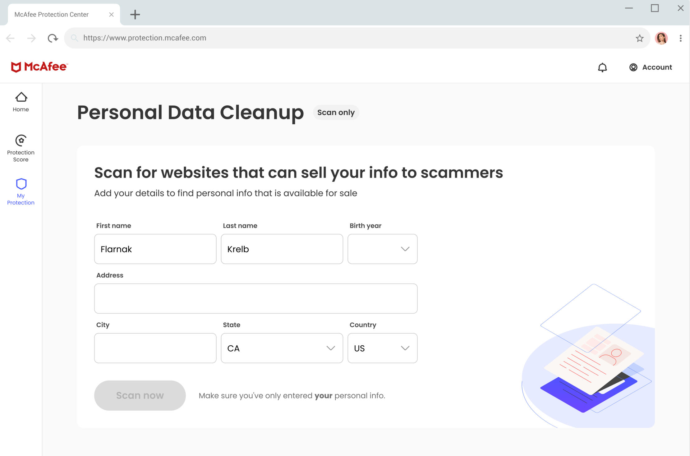
IMPROVED ENROLLMENT SCREEN WITH CLEAR MESSAGING & SIMPLIFIED FORM
Problem
The initial Personal Data Cleanup enrollment process was cluttered and complicated, causing users to become frustrated or confused. This led to a high drop-off rate during enrollment — with few users completing the feature setup.Goal
Simplify the enrollment flow by reducing unnecessary steps, improving the clarity of the messaging, and enhancing the overall experience to increase feature adoption by our core users.Result
The redesigned flow eliminated education screens, clarified the enrollment process, and simplified the dashboard. Early data showed a 27% reduction in drop-offs during enrollment and a 19% increase in user engagement with the feature.Contribution
I combed through a vast pool of prior research findings on older adult users to determine specific user pain points in the original feature flow. I then worked with a UXR to run moderated user testing sessions with key McAfee users. Lastly, I collaborated with two product designers and a marketer to remove redundant screens and educational content so friction points were addressed.
PROJECT 2: MCAFEE TRIAL ONBOARDING EXPERIENCE
ORIGINAL INEFFECTIVE TRIAL SCREEN EXAMPLE
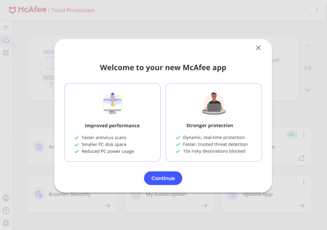
IMPROVED TRIAL SCREEN WITH STRONG MESSAGING
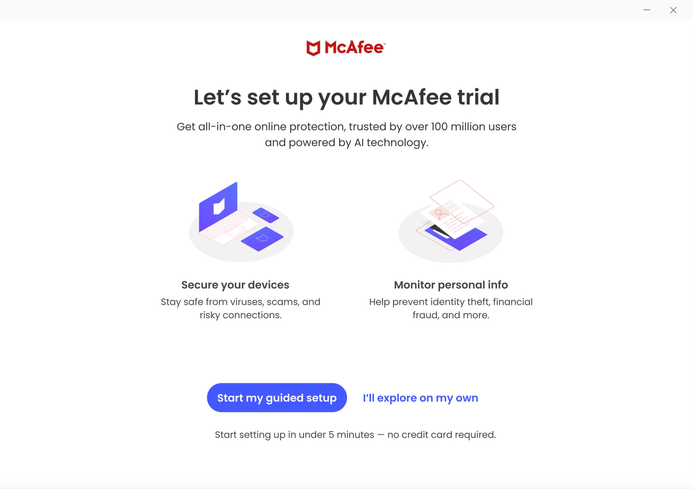
Problem
The initial McAfee trial experience failed to effectively demonstrate product value, resulting in low conversions from trial to paid plans. User research indicated users left the trial feeling uncertain about how McAfee would protect them and the benefits.Goal
Simplify and enhance the trial experience by creating an intuitive onboarding flow and dashboard. The redesign should clearly communicate McAfee's value proposition, drive feature engagement, and increase trial-to-paid conversions for new users.Result
The redesigned trial experience significantly improved user confidence and adoption. Early metrics showed a 32.6% increase in feature engagement during trials and a 30.2% rise in trial-to-paid conversions within the first week of launch. Users reported greater understanding of McAfee's protection capabilities and how these aligned with their needs.Contribution
I reviewed and analyzed user research data to identify key decision points in the trial journey. Then I collaborated with a UXR to validate messaging approaches through user testing sessions. Additionally, I partnered with the product team to lead a week-long design sprint, where we prototyped and refined the dashboard experience based on user insights.
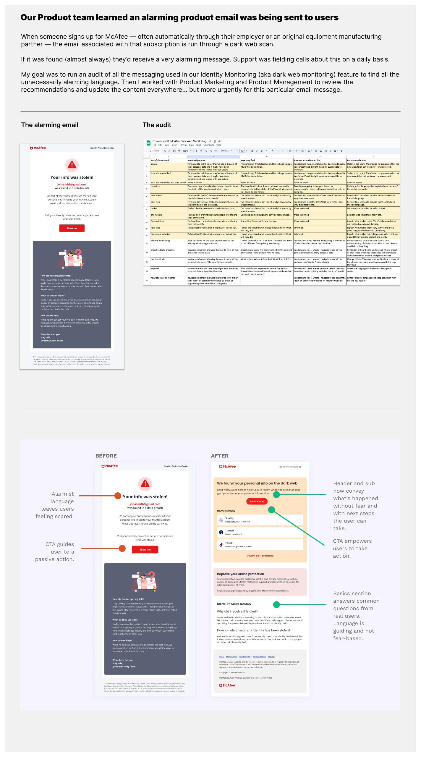
VARIOUS MCAFEE CONTENT DESIGN DELIVERABLES
VOICE & TONE GUIDE
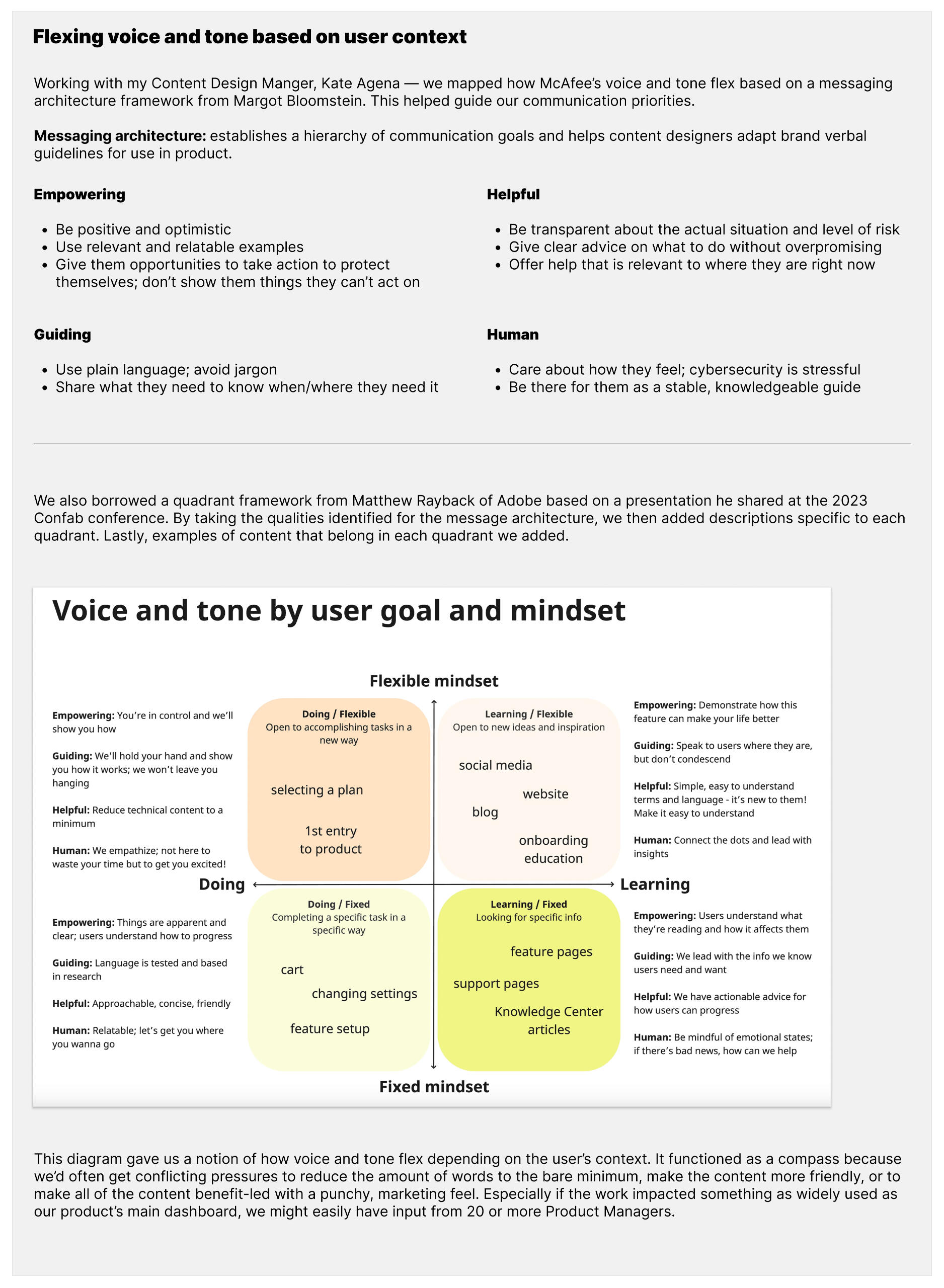
CONTENT AUDIT
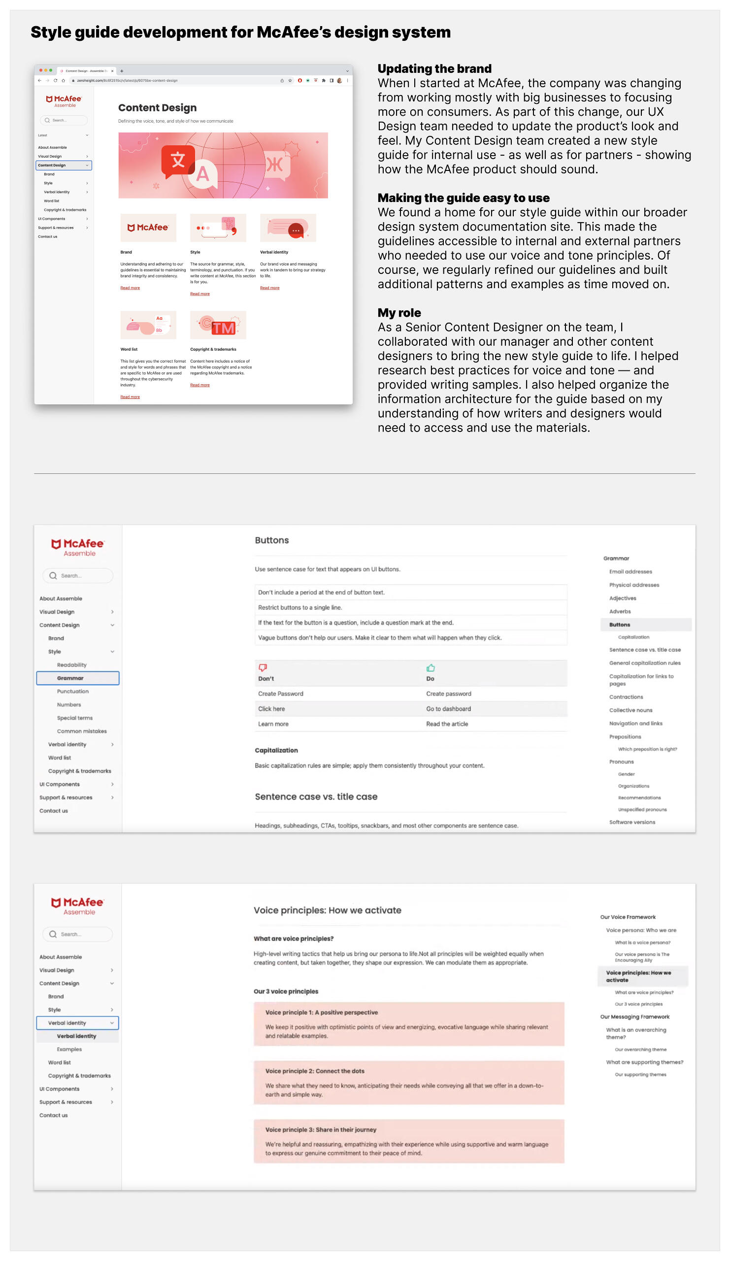
ASSEMBLE: MCAFEE'S DESIGN SYSTEM
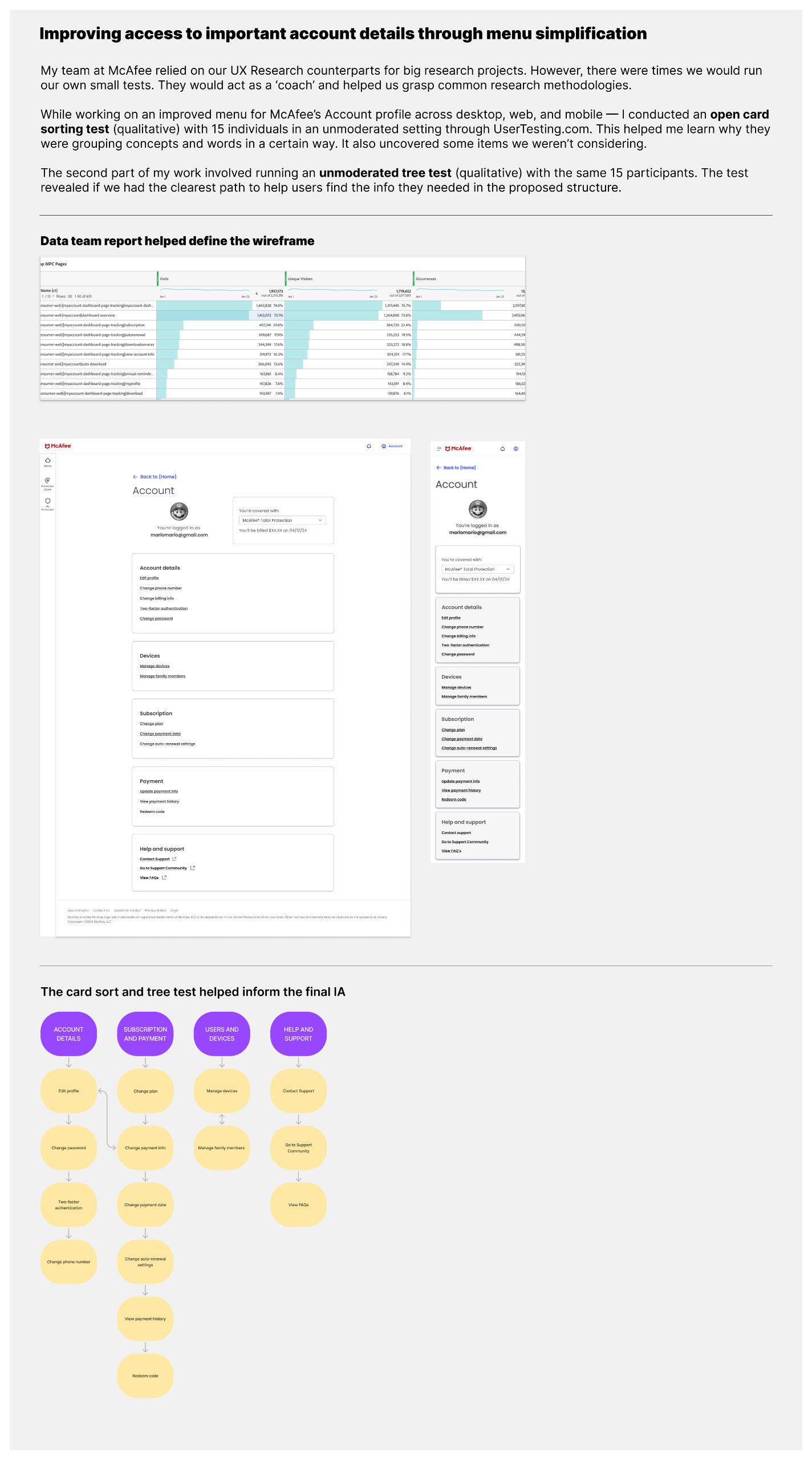
TESTING: INFORMATION ARCHITECTURE
© Bryan Kelly. All rights reserved.
PREMERA BLUE CROSS
Premera Blue Cross is a health insurance company in Seattle, Washington and offers a suite of products to over 2 million members. Their UX, product, and content teams wrestled with a 2-year delay on a member website redesign intended to reduce member friction and convert prospects.
PROJECT 1: MEMBER DASHBOARD
Problem
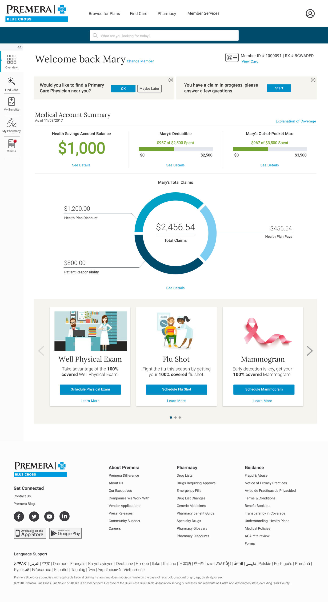
Members had a difficult time understanding plan and claim details on their dashboard. Terms such as Deductible, Out-of-Pocket Max, and HSA were confusing. As a result, the call center received many simple but very important questions. This had a high cost.Process
Working with the Lead UX Design Strategist, we spoke to Customer Service about the most common member questions. Then we identified existing dashboard friction points.Solution
Clear headings and labels identified the most important items for members. "See Details" and "Learn More" also linked to help articles to reassure members and reduce doubt. CTAs guided members to helpful resources. The final redesign led to eliminating more than $1M in Customer Service related expenses.Contribution
UX/UI copywriting
PROJECT 2: MENU NAVIGATION
Problem
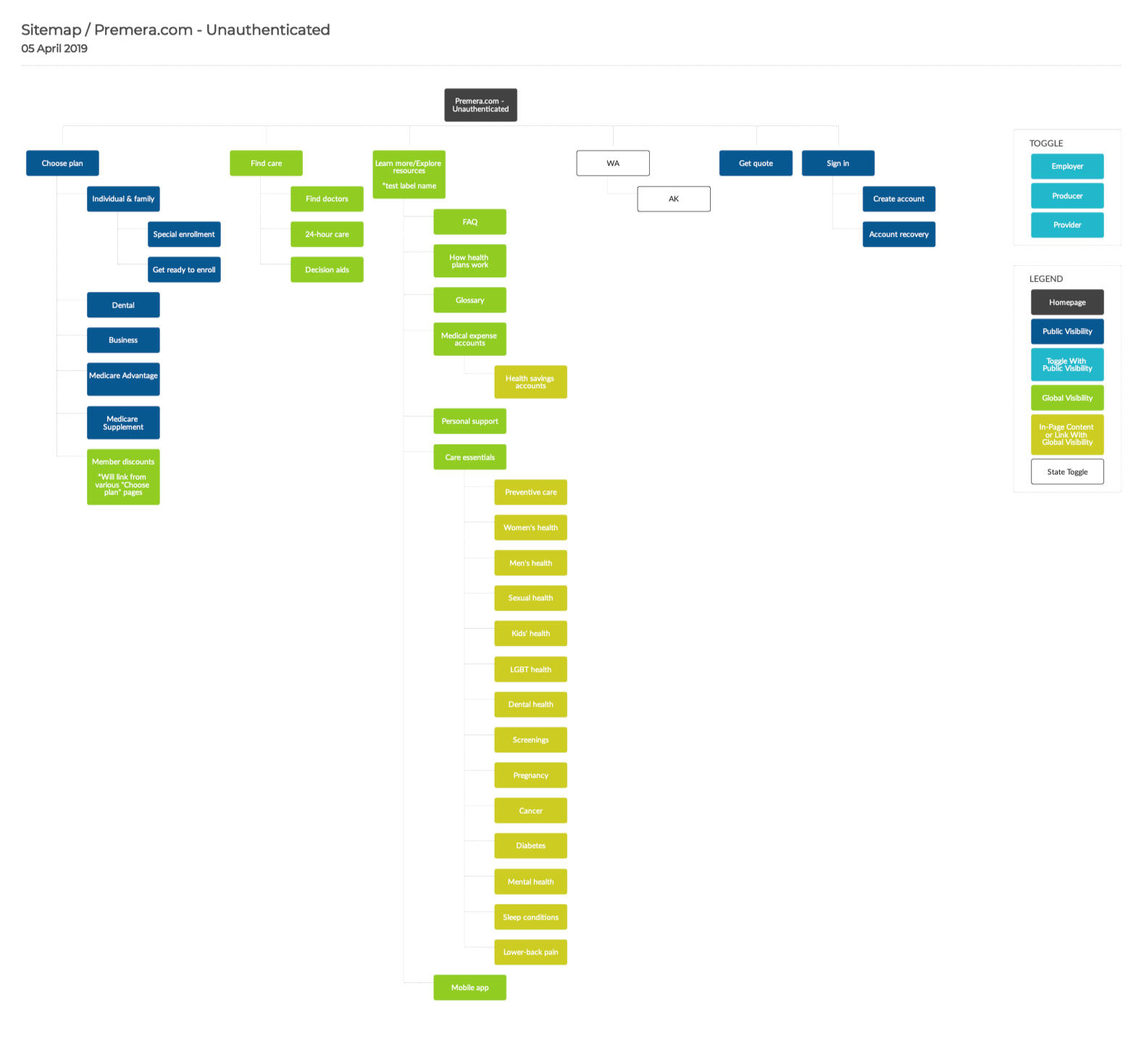
Prospects couldn't find the insurance-related details they were seeking. The previous menu was confusing. Labels didn't match page content and provided little information. This had a negative impact on lead generation and revenue goalsProcess
The job was to redesign the menu navigation for non-members (unauthenticated users). I first reviewed the site's user data and a recent content audit. Then I conducted a card sorting exercise to define the clearest hierarchy and labeling.Solution
My new Information Architecture fixed the problem by first focusing on three clear non-member actions: (1) Choose Plan, (2) Find Care, and (3) Explore Resources. Removing friction points allowed prospects to quickly access information they needed most.Contribution
Information Architecture, UI copywriting
© Bryan Kelly. All rights reserved.
EXPRESS
Express is a a 40-year-old fashion retailer best known as a mall brand. Because mall dynamics had been shifting, they began rebranding as a fashion authority for millennials. After making large eCommerce strategy investments, they explored how content might help achieve this goal.
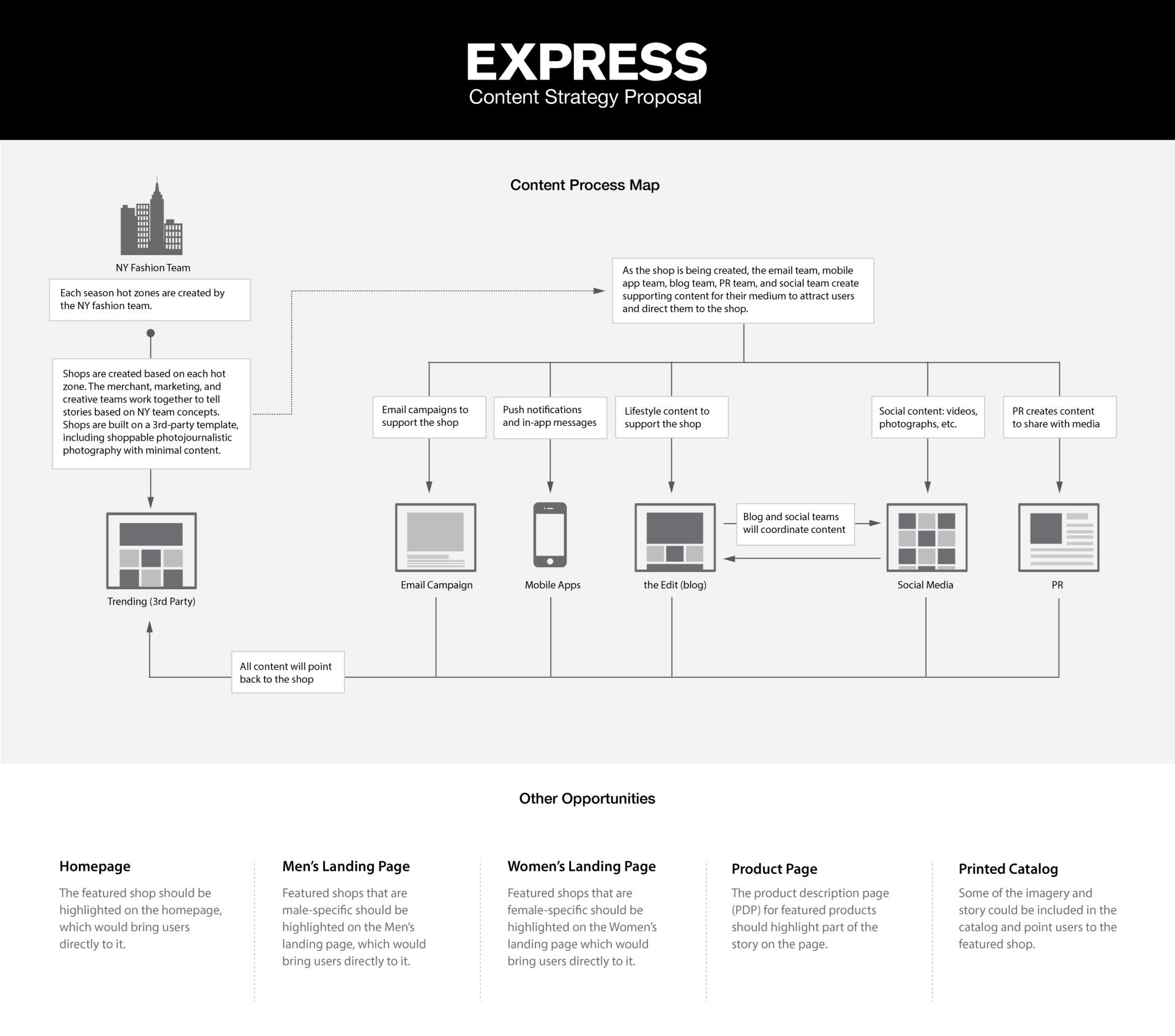
PROJECT: CONTENT PROCESS MAP
Problem
Newer brands such as Mr. Porter had used content (paid, owned, and earned) to attract, educate, and sell product to customers. Express had the resources to execute this same strategy, but not a clear and coordinated plan.Process
A Senior Product Designer at Express asked for my content marketing expertise to craft a plan to present the VP of Customer Experience. Using a scorecard I reviewed the team structure across design, product, and marketing to identify gaps. This revealed a way to efficiently generate a high volume of quality content.Solution
I co-created a Content Process Map and presentation deck with recommendations. This described how to blend content with the shopping experience. The first step would be a homepage view in the mobile app allowing users to explore content or shop with a tap.Contribution
Content strategy
© Bryan Kelly. All rights reserved.
ASSOCIATION ANALYTICS (A2)
Association Analytics is the leading provider of business intelligence and data analytics for association professionals. After decades as a consulting service, they spent 2 years turning their most popular analytics service into a SaaS platform with hundreds of pre-built integrations.
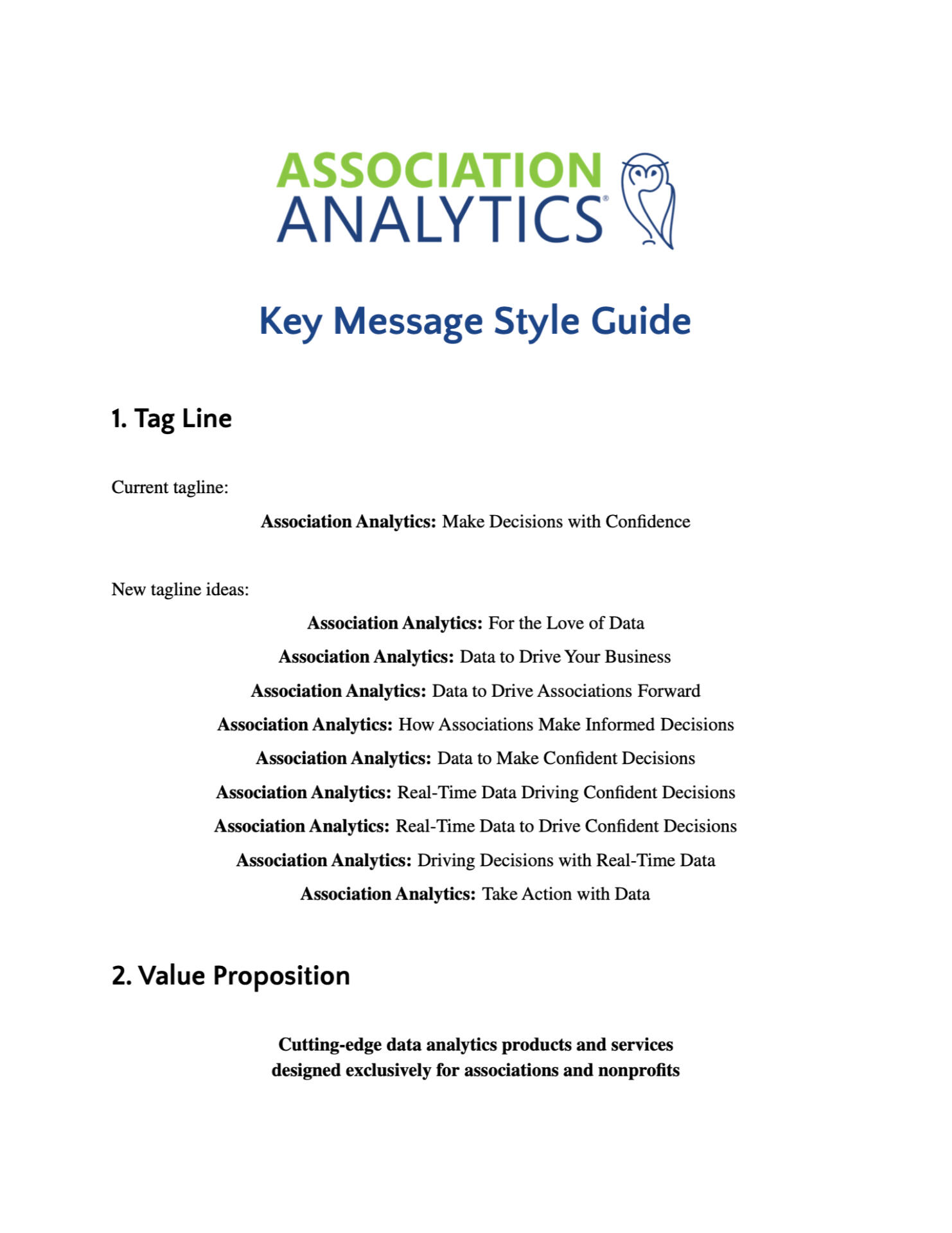
PROJECT: STYLE GUIDE
Problem
Before launching their new SaaS platform, Association Analytics needed clear messaging guidelines as part of an effective go-to-market strategy.Process
I worked with the CEO and COO to dig into the brand’s core strategy, including its mission and value propositions. I then identified the key benefits of the product and worked with another content strategist to create the guide. This included several headlines, bullets, taglines, and more to make the benefits stand out.Solution
The guide included a comprehensive series of messages for the brand. It was the springboard for writing a full lineup of marketing materials for the go-to-market plan. These materials included a new website, emails, landing pages, and sales sheets.Contribution
Style guide
© Bryan Kelly. All rights reserved.
FanGuide Tour & Audio Companion
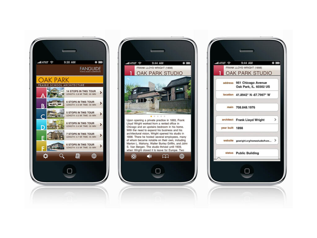
FanGuide was the first iOS architectural tour guide app series launched on Apple's App Store in 2009. This data-heavy guide pulled together vast amounts of tour-related information: points-of-interest, photographs, video recordings, guided audio, GPS coordinates, and more.
PROJECT: iOS App Content
Problem
FanGuide's engineering team needed to import a massive library of content that was written, recorded, and produced for 4 different tour guide apps in the series: Chicago, Oak Park, Los Angeles, and Palm Springs. The challenge was meeting a tight launch deadline with only 9 weeks to package everything for release.Process
After writing the UX and UI copy for hundreds of points-of-interest, I prepared over 150 property lists (aka p-list files) using PlistEdit Pro. These files contained metadata about every single piece of content and where it should appear in each iOS app. This included tour overviews, tour stop descriptions, trivia facts, photographs, audio/video files, GPS coordinates, map details, architect biographies, public building information, and more.Solution
Once uploaded to the appropriate server, each property list was able to seamlessly flow into a database the engineering team setup for this series of iOS apps. There was zero delay in fully compiling the apps for distribution and the launch deadline was met.Contribution
UX/UI copywriting, Data management
This 2 minute video shows the depth of data described above.
© Bryan Kelly. All rights reserved.
FanGuide Tour & Audio Companion Video
© Bryan Kelly. All rights reserved.
